Sunday, 23 May 2010

Reflections: Final

I am pleased with my progress this term and especially the speed in which I have completed my work and been able to use the Maya interface. At the start of this term I would have been impressed that I have completed a few different walk cycles, a character lip sync, as well as the Pirates of the Produce Aisle scenes and making the DVD.

Positives from the term:
  • working within a team to create the Pirates film
  • animating rigs that I have not created myself as this is likely what I will be doing in the Industry (normally I create my own rigs, so it was fun to get straight on with the animation and modelling not take up all my time)
  • I haven't touched walk cycles for about a year, it's nice to get back to learning and improving my basic skills
  • Same for the lip sync animation, I wish I had spent a bit more time on Verbal's expressions but I think his lip sync is pretty good
  • Working to deadlines set by myself and the Pirates team to make sure all the scenes were finished on time
  • Taking advice from the lead animators, it was nice having someone evaluate your work constantly and getting regular feedback
  • Using a mac to make the DVD
  • I have been far better at Blogging this term and have used it at every opportunity. I could probably have done some more research but I think this is easier for when you are creating your own characters or environments for pictures etc.

Negatives:

  • It seemed to take forever to get the Pirates rigs, and because I was unsure of when I was getting them I kind of held back my other work until I had done it. I did not want to start something else major then have to leave it and lose track of it.
  • I did not complete a lot of things I wanted to do, such as the water effects and also an animal walk cycle. This is going to especially be a focus for me during the summer.
  • I also did not realise that I had to ask permission for my DVD music, and I have still not had a reply to my emails. This is something I will plan far more in advance.

Aims for the Summer

  1. Animal Walk Cycle
  2. Continue with my character animation - I would like to model and rig a character from scratch then use my own voice or record someone else and create my own scene from scratch.
  3. So... modelling and rigging. I especially want to look at rigging as this is a sought after skill in the Industry and links well to animation so you understand how the structure works better
  4. Life drawing!!!
  5. Any other drawing!!!

By the time I come back to University in October I want a completely new Showreel with far more complex work on it. I may even look into creating a rigging and modelling ahowreel and also an animation showreel to showcase a variety of my work.

Overall:

I am pleased with my term of work, I know that I could have done a bit more to give the last finesse to my work, but I have learned a lot about what to do and what not to do for my own final project next year and I know I want to have my team finished far before this stage.

Friday, 21 May 2010

Copyright Music

Here are the emails I sent regarding the music I used on my DVD. I realise I shouldn't have used the music without their say so but I am hoping they will both say yes. I cannot see why they wouldn't say no as I have made it clear it is not a public file. I am now just waiting for their reply. The Broken Sword music I used on my Photography slideshow was downloaded from their website so I do not need to ask for their permission.


'Hi my name is Hayley Allen and I am an Animation student at Ravensbourne College of Design and Communication.I am writing to ask for permission to use the Gorillaz Stylo as background music on my portfolio dvd of my animation work. This is for my final term project and will NOT be made public, so therefore will be seen by myself and my tutor only.I can credit the music to you if you wish.Thank you for your time,Regards,Hayley Allenmailto:Allenhayley.allen16@btinternet.com'

'Hi my name is Hayley Allen and I am currently a student at Ravensbourne college of Design and Communication.I am writing to ask to be able to use Lady Gaga's Bad Romance as backing music for a slideshow of my drawings to put on my portfolio dvd for my uni year.The DVD will NOT be publicly shown and will only be seen by myself and my tutor.I would appreciate this as I love the song and feel the vibrancy of the music suits my style.Thank you for your time,Hayley Allenhttp://uk.mc860.mail.yahoo.com/mc/compose?to=hayley.allen16@btinternet.com'

Final Stages


Well finally... after months of work... here are the final stages of my Industry Exercise 3 project.


The first stage was creating my final DVD that works on a DVD player. I used a Mac and DVD Studio Pro to create the DVD, which was a first for me as I am a PC user. The pictures above show my notes that I took in lesson, but I found that when it came to using the program that I didn't really need them and only skimmed through for a couple of points.


Above: proof of using the Mac :)
I did have a few problems using the program because I am not used to the buttons and commands of a Mac and kept using my PC shortcuts. I also spent ages trying to open the DVD drive without avail until I was told that there is a button in the top right hand corner that opens it. There was also problems with the final renders but after 3 attempts it does work.


Here's the final packaging for my showreel. I like that is keeps with the style of the DVD and has quite striking colours. I printed the inserts out at University after trying at home because the colours came out stronger and it looks more professional than my printer at home.


Proof that the DVD works! Woo!


DVD Menus

The next stage in the development of my DVD was to create the different menu screens. I realise that I already had the menu background images, but I wanted to use my previous research to enhance my dvd, so I created a little bit of movement on the one by using Trapcode Particular in After Effects.

I have used a little bit of After Affects before, and only used it very basically here as I did not want to distract too much from the already busy background and also the moving images for the button links.

I am really pleased that I did this because it does add to the pages, makes them a little more creative and saves from having a boring static background. It also shows a mixture of skills that have gone into making the DVD. For the menus alone, I utilises Maya for the 3D lettering and grid, Photoshop to crop the images, After Effects to add the light effects across the grids, Premiere to convert the After Effects files to MPEG-2s and also change the size of the image so that it was fit to Broadcast, and finally DVD Studio Pro to put the DVD together.

The only thing I wish I had done is try out different styles to see which one I prefer, as I am still finding out my own artisitic style. I am pleased with the design of my DVD, I hope it is a little different to everyone elses and does look more professional with the added effects.

DVD Packaging

When it came to the DVD packaging, I wanted to use my own work a bit like when they have still images of a film on the back of a movie case. I therefore print screen copied images from my Showreel to decorate the case.


I want my DVD to be personal to my wokr, so as well as the screen grabs I wanted to use my signature as my logo or trademark, as it is what I use to sign all of my drawings.


The image below shows my final cover design, I kept the theme of the Maya grid from my DVD and added my work images to it. I wanted the background to be dark as I thought this would be quite striking and maybe stand out from coloured cases. The black also highlights the blue and yellow lines as well as emphasising the colour from the screen grabs, so the work jumos out from the case.
This would be good if I sent the case to employers as it gives them an idea of what my work entails even before they open the case. It is evident that I am an Animator and the sort of packages that I use.


Tuesday, 18 May 2010

New Improved Showreel!!

This term is finally coming together, here is my new improved showreel including my work from this term :)

I think it is better as my Post Production scenes I weren't entirely happy with have been reduced but are stll there to show I can do it, but it is obviously focused on animation.

Hayley Allen Showreel 2010 (number2) from Hayley Allen on Vimeo.

Mr Bean Final Walk Cycle

I have finally finished my Mr Bean Walk Cycle today, and decided to render it to give it a different look on my showreel to the Pirates and Verbal playblasts. I am quite pleased with the foot movement on this, and it does match the scene perfectly.

I think I could spend more time on this over the summer adding facial expressions and refining the movements, but I am pleased with it in time for my deadline on Friday.

My next aim is to convert my last few files and to create a new version of my Showreel.

Monday, 17 May 2010

Reflections: Week Seven

This week has been taken by my showreel portfolio. I am quite pleased with my progress as I have managed to decide on a theme throughout the menu screens as well as finishing one of my animations and being close to finishing the other.

Positives:
  • Finished the Usual Suspects lip sync animation
  • Researched DVD menu screens
  • Experimented and managed to create a style of my own for the DVD
  • Decided on a layout - Main menu, 2d and 3d animation, galleries and contacts
  • Nearly finished the Mr Bean walk
  • Converted the video files I have to MPEG-2 ready for the DVD
  • Found some more drawings for my Galleries

Negatives:

  • I haven't got a lot of time left to put the DVD together and it will be in one session
  • I am having trouble getting Encore so may have to rush it at uni

Aims for the week:

Well this is the last week coming, I still have some of my other University projects to complete so I will be happy if I manage to get all of my existing work onto the DVD. I will get all of the files ready before I start so that I can literally just place them and hopefully complete it quicker. My aim for today is to finish the Mr Bean walk cycle, and if I cannot get Encore then I will add lights to the menu backgrounds using After Effects.

Otherwise I just hope I have done enough this term for my Pirates team as well as my own work to get a decent grade. :)

Usual Suspects: Verbal Clint

This week I managed to finish my Verbal Clint animation taken from the Usual Suspects film.

The expressions aren't quite as over the top as I had wanted, but I didn't want to make them change too quickly and make him look more thoughtful. I am pleased the the Lip Sync which was the main focus of this piece of animation, as I already have expression from my Rocky animation and also now my Pirates of the Produce Aisle sequences.

I now just have to complete the torso and head movement for my Mr Bean walk cycle and I think I will then have an effective variety of scenes (obviously including this year's work) to make an exciting and interesting portfolio. I am also going to change my Showreel around to incorporate these new scenes and remove some of my Post Production work.

DVD Other Menus

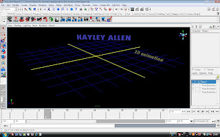
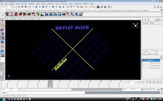
Here are the other menu screens for my DVD. I have kept with the same grid layout so that my DVD is consistent throughout, although I have changed the angles to create a bit of diversity.


I will be cropping the images so that the Maya borders cannot be seen, and still wish to create some light going across for a little bit of movement. I still like the retro style and hope when the moving images of the video are placed on top that it looks effective.
I have been struggling to download Adobe Encore when my copy no longer works, so if I am unable to download it this afternoon then I will finish my Mr Bean Walk Cycle completely and hope to have everything ready to make the DVD tomorrow or Thursday at Uni.

Saturday, 15 May 2010

DVD menu attempt one

Ok, so here is my first attempt at my DVD showreel main menu, obviously without the links as this footage is from After Effects. I am going to add the Gorillaz music to it that I used on my showreel if I cannot find anything else I like before hand in next week.

If I have time after converting all my videos etc. I am going to add some lights going across in After Effects just to make it look a little more interesting. I will make sure everything is ready for me to link onto the DVD next week however and I aim to make the DVD in one session.

DVD menu

I have started looking into the look I want for my DVD.
I looked into the Star Wars DVDs because I always like how they have the moving footage within the scene, I want this to be something I include in my main menu.


I also found this video on Youtube. I like the menu especially showing the footage, but I would prefer to have less movement in the backgrounds so it is not too over the top and hard for the audience to focus. I may have a little bit of movement but no animation in the background (which I was initially going to do) for this reason.


I initally thought of having a cinema screen with my showreel being shown on it, and using my signature as a logo in the stars like in the second image below. I did start on this but thought it would be a little too normal and may not make my work stand out to the audience.


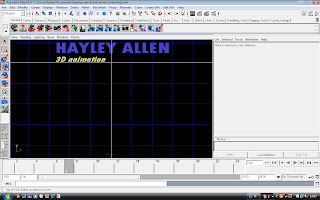
I then started playing around in Maya with my name and making it 3D, and thought it may be a bit different to actually use the interface as my menu, making the links on the right hand side and then maybe animating in the space around my name or making my showreel appear in the gaps. I tried a few variations of this:


I did start to use the first image, but thought that the grey was a bit overpowering and also that it may off put people from looking at the DVD, so I began having a play with the colour schemes for the 3D space and the grid lines and got this result:


I much prefer these colours as it makes the menu stand out more. However, after viewing the screen like this it does not really match well with the UI elements of Maya. I tried looking into changing their colours too but apparently you only can on Linux and I have a PC. I also began to wonder if there would be copyright issues with me distributing the Maya image as my menu without their permission. I realise that I have used it in my Playblasts but that is different from using it as a brand.


So I finally decided to cut off the UI elements and just use the centre screen as my menu. I like it because it is a bit retro looking and suits my interest in computer games. I am going to add my showreel to the front of it and have the links to my animation and galleries down the front left hand side.
The grid is also good as I can change the angle easily and use it for the sub menus of my dvd. This will keep the consistency and the style throughout, which was something I was struggling with.


Wednesday, 12 May 2010

The Heat is On!

I just received this email from Mike Smith, Head of Animation on my course:

'Hi All 1st and 2nd year animators,
On Friday 21st of May all of you will be handing your final projects. Your
hand in deadline is 4pm. After this date you have finished all your studies
for this academic year and will be starting your holiday! You will not be
expected to come into college again until the new academic year starts on
Monday October 25th.
As we all realize this is a very long summer holiday for you lasting a
staggering 5 months! It is crucial you properly use this time to continue to
improve and develop your practice and identify your specialism. Jared and I
will be talking to you all in the lecture theatre so that we all know about
the support and guidance we have made available to all of you during the
break.
Please make sure you all attend this meeting *in the lecture theatre at 4pm
on Friday 21st.*
An end of year drink will then be suggested - possibly at "The Kings Head "
in Chiselhurst![?]
See you all then,
Regards,
Mike'

So...
This means that my project deadline is a week earlier than I anticipated and I really must work hard this week to make sure it is completed on time.
I am going to focus this week on finishing my animations and collating all of my work so that I can compile the DVD together in one sitting next week. This means my focus for the next couple of days is my Mr Bean walk cycle and Usual Suspects lip sync, and I will use the weekend to convert my other files and hopefully do some more drawings for the DVD.

I aim to have the Mr Bean scene blocked out by the end of tonight ready to add tweaks and improvements to tomorrow, and then move on to the Usual Suspects for facial expressions.
I am not going to try and improve any of my previous work because time is short and I also think it is not necessary for this project.

Monday, 10 May 2010

Scene 55 'Neeeeevvvvveeeeerrrrrrrrr!'

These videos show my progress with shot 55. As mentioned earlier I started by creating the expressions for Breadbeard and the Guard seperately as I feel I would not get as confused this way and could focus on them seperately. I then imported Breadbeard into the Guard's scene.

I animated the Guard's claw arm first because it was the hardest to move and the angle of the claw determined where the rest of the scene would be (like where the Guard could stand without it going into him or his moped), likewise for the Captain and his sword. I then moved onto rotating the bodies to add more force to the movements as well as the heads and finally the other arms.

The scenes took a lot of tweaking, especially because with the Guard when I moved his body in any way it affected his arm and I had to move the sword or claw to compensate. Furthermore, in the animatic the claw just swings out to the left hand side of the screen and seems to not touch the sword when it flies in the air. I followed this originally, but after some thought and guidance from the team I changed it so that the Guard overpowers Breadbeard and flings the sword in the air by putting the claw underneath after knocking him backwards.

I think it works much better this way, although I did have to delete a lot of keys and redo key sections to make the flick up look effective. This is especially true for the arm where I had to work out how it would counterbalance the weight. I tried to make it not move too much as I found mine did not when I practiced the actions, but then when he swings and needs more power that is when the other arm comes into play more. I think the action is convincing and gives the illusion that he does knock it out of his hand.

With regards to the animation principles, I obviously had to use timing for this as the sword and claw had to meet at the same time and the characters react to each other accordingly. Another main one I tried to incorporate before the push was anticipation by making the guard lean backwards and hunch together slightly before pushing forward.

Above: The final version of Scene 55

Scene 56: Sword action

The sword shot was also relatively easy to complete, although I did spend a bit of time working out the arcs for the sword and the timing to make it look convincing and not too fast, or have too high an arc for where it was going to land. I also had to consider the positioning of the camera in relation to the arc so that it would not disappear on and off screen.

This is the final shot for Scene 56 :)

Shot 41 Changes and Final

Ok so this was my first attempt at Walker. I weren't really sure what to do with him but I tried to follow the animatic with the timing of the turns and this was the result. I uploaded it onto the Pirates blog and had some discussion with Tom about it, saying he needs to remain looking in the direction the canon is shooting and also that his fist needs to be clenched. I made the changes for my final shot below:

Shot 41 Final

Reflections: Week Six (?)

Last week as been my hardest working by far this term, and I am pleased to say that within the space of a week I started and completed all six of my scenes for the Pirates of the Produce Aisle film.

I am most pleased with scene 55, with the Guard fighting Breadbeard. This is the shot that I took the most time over (other than the lightning because I had so many versions) and was also the hardest to animate because of having two characters and also the level of interaction that they have.

The most difficult thing about the scene was the sword and the claw hitting each other because the rigs were designed that when ever I moved the body the arms and therefore the objects also moved with it. This became a problem when I had sorted the two hitting each other and then needed to add more weight or dynamism to the characters, as I had to redo all of the arm movements or alter them to connect again. I do think it was woth while though, and I especially like the movement at the end when the Guard flicks the sword out of Breadbeard's hand because it is quite smooth and I like how Breadbeard holds his hand longingly in the air.

Positives for the week:
  • Pirates shots are FINISHED!
  • I learned alot about the graph editor and how the smallest change on it can make a big difference to the animation
  • I have also learned alot about rigs and what not to do
  • Blend shape animating
  • Found more drawings for my DVD

Negatives:

  • I haven't really touched my showreel work so I need to concentrate on it this week

Aims for the next week:

As I say above the DVD showreel is now my priority. I have had the weekend off animating after the Pirates project so will start again on Tuesday or Wednesday. I aim to have the Mr Bean and also the Verbal Clint animations finished by Friday. Furthermore, I wish to use my showreel as a running video on my main menu, so I will try and cut a new one together by the weekend using After Effects.

For tonight, I am going to look into my drawings and converting my videos to MPEG-2s.

Thursday, 6 May 2010

Walker!!

This morning (woo a day before deadline) I finally got the Walker rig sent to me by Tom. I started animating with him straight away although I did have a few issues to begin with.

here is the rig:

The main problem I had was when I tried to move Walker his jaw became all deformed and did not move with the rest of his body. I moved the pirate ship to underneath him rather than moving him to the boat because I thought this would be easier, but the problem still persisted even when merely rotating the body as you can see here:


I parented the two jaw handles to the body handle of Walker so that when it moves the jaw moves with it. I parented it to this one rather than the base handle because Walker does not move anywhere in my scene and obviously he will be moving/rotating more from his hips. This seemed to work, even though there were some wierd movements when I was animating that I had to move the head and jaw to correct and make sure it did not come out all skewed.


Scenes 17 and 18

Sooo.... here are my results after playing around with Tom's lightning strikes.

I think they look far better than my original movements and it actually looks like he has been hit by lightning now.

He also has two/three key poses similar to Mace Windu from my research but still shakes throughout which I am pleased about.

I have not touched the facial expressions for these scenes as I think Tom did a good job with them and I wouldn't really know how to add to them, but I am pleased with the overall movements.

The camera angle for the last scene is debateable because the height of the plinth and the size of the Guard and also his position are different to the animatic. I am also sceptical because the claw is coming from his left hand in comparison to the right in the animatic, and I feel that some of the other group members may put it in his right. This is also true for later in the film when my Guard is fighting Breadbeard they are both left handed and this may cause continuity issues. Lewis the team leader says it does not really matter but we will see how important it is from the finished result.

Star Wars Research:Fighting

Following on from my lightning research, I looked into the actual light sabre fighting for the scene where the Guard and Captain Breadbeard clash.

I know the Star Wars scenes are more over the top, but I like the fast pacing with frenetic fighting that is intercut with slower sections when they are at a deadlock and pushing against each other. I think I will use this in my scene so have the characters have a quick section and then a slower force against each other before the Guard overpowers Breadbeard

Tuesday, 4 May 2010

Star Wars Research: Lightning

For a bit of research into lightning hitting people (not the best thing to search for) I remembered some of the Star Wars films and Mace Windu being electrocuted by the Emperor in Revenge of the Sith.


This video really helped me with my movements and how he has a couple of key poses and uses his shoulders to move alot. This means that the Guard must have some rotation in his body not merely shaking and the arms move up and down.

It did also show me that if the lightning is done effectively then his poses may not be seen too much, although from the side view I am doing they may be.

So he must shake, which I will try on twos, but move to two or three key positions whilst shaking throughout. As this is for an animated piece rather than film I will exaggerate the movements more than what Mace did so they look effective and also provide a stark contrast to the slow small movements of the Guard beforehand.

Scene 53

Here is pretty much my final shot of Breadbeard unsheathing his sword.

As he did not have a belt for his sword to rest in I decided to start the scene with the sword already out and just create the motion of him moving it infront of his body. This was also advantageous as the sword is quite large and getting it around his body would have been harder if it was right next to his side, as I did have to move his other arm out of the way and bend his wrist effectively to make the sowrd miss his stomach.

I am quite pleased with this scene, I think it works well and I like the way the wrist turns around in the centre to make the sword be held properly and ready to attack. I also like his facial expressions looking pleased at the Sword and then changing to menacing as he looks back at the Guard. This may be the only think I accentuate is the mouth opening a little more, and also maybe playing with the weight around his chest, maybe making him stick his chest out in more of a powerful and proud pose, although this will be additional to me completing the rest of my scenes.

Shot 55 'Neveeerrrrrrrr!!!'

I started Shot 55 'Neveeeerrrrrrr' with the facial expressions and lip sync of the characters because I thought they would get lost in the movement of the scene otherwise. It was easier for me to do this individually so I kept Breadbeard and the Guard in seperate scenes first and then imported the Captain into the Guard's scene to make I combined one I have been using for the movement.


This scene is currently work in progress although most of the movement is done for it, it just needs a bit of movement in the Guard to make it look more authentic. I will be working on this tomorrow and will upload the final stages then

Reflections: Week Four Onwards

I haven’t updated my blog for a while for personal reasons and also because I did spend quite a long time waiting for the Guard and Breadbeard Rigs. The first scenes that I tried were the hit by lightning ones because once I have finished the movement it will be possible to move the camera from the side shot to closer in and not have to repeat or create more animation. This means that I can complete two scenes in one go.

I did have a bit of trouble with his arms as I timed it using the team’s animatic and this made his arm movement erratic and too fast. I then did a couple more tests where the arm movements are smaller but faster, and also animated the hand as this made it look more realistic and also gave the movement follow through and over lapping action.

However, I found out afterwards that Tom from the third year has also created a version of this scene, but I am unsure about his version too because it his very basic jittery movement and it changes between three poses without much flow. I will therefore will try and find a balance between my own attempt and his. Hopefully a combination of the two will look right for the Guard. I am unsure if my scene will be used in this case, but at least I will have more to show for my project this term and hopefully I can create something that will look good on my Portfolio DVD and maybe even my showreel to send to prospective employers.

I have a deadline of Friday for all of my scenes to be completed, so here is my plan for the week. I am going to put my own work aside for the week and obviously concentrate on the Pirates scenes to get them completed on time. Wow a week for all of the scenes… and I don’t have Walker yet!

Schedule:

Monday:
Finish Breadbeard’s expressions Sword Pull Scene
Finish expressions Guard and Breadbeard face off (I have already done the lip sync for the Guard)
Basic block out of movement for the beginning of their tussle
Tuesday:
Guard Electricity scenes
(finish movements of Guard and Breadbeard scene if I hear back about ending)
Wednesday:
Hopefully I will have Walker by this stage, so the Canon scene
Sword hitting the Boat scene (this shouldn’t take too long)
Thursday:
Touch Ups!!! Make sure everything flows smoothly, is timed well etc etc
Friday:
First thing in the morning, send all the files to the Team!


I have completed all of my aims for Monday and feel if I push myself this week I will finish them all on time. I just hope I can get Walker soon as I could even complete that Tuesday evening.

Positives for the last few weeks:
I have carried on with my Mr Bean Walk Cycle
I have also learned how to create the DVD for my project and feel confident with the work I will put on it
Started collating my drawings and photography for galleries on the DVD, as well as started converting my videos into MPEG-2
Although my Guard scenes that I have been working on the last few weeks will not be used, I have learned the capabilities of the rig and I am getting quicker at animating with him.

Negatives:
I have only just got Breadbeard and I want Walker!
I have to redo the electricity scenes, especially as the claw is now in the other hand to the animatic so I was animating the wrong one L
I haven’t been able to do much therefore for the Pirates film, and started losing a bit of my positivity towards the term’s work, this has returned since I got Breadbeard however and I have enjoyed animating with him.

After this week, I will have about two or three weeks to concentrate on my Showreel DVD, which is great as it will give me plenty of time to put some great work on there.

Breadbeard

I finally received Breadbeard on Friday and started animating with him straight away. I started the Sword pulling scene first because he is on his own in the scene and it meant I could get used to the rig. I am quite pleased with the results.

When I received the file he did not have his sword, so a quick email to Tom and I got the file. Obviously it wasn't to scale as you can tell from the image below:


I parented the Sword to his left hand to make moving the sword much easier. It also meant it stays firmly in Breadbeard's hand when he is pulling it up, and I only had to animate the angle so that it did not stab his other arm or body.

I do quite like his rig, although the facial controls for all of the characters do annoy me as I prefer to use Facial Controllers rather than Blend Shapes, purely for the fact that they are easy to see and all together, you can also see the different keyframes for each individual part on the timeslider instead of needing to open the Graph Editor if you change your mind.

Breadbeard also does not have a control for his jaw which the Guard has, which means I had to use the Lower Lip B.S. and the Neutral one, which was not good because it causes deformation to his lips and face if I try to open his mouth too far. I wanted to do this to make him look more menacing and angry, and also to look more in shock when the Guard shouts ‘Never’ and is aggressive with the claw.

On the other hand, I do like the expressions that I can create with Breadbeard as he has a lot of Blend Shapes for his eyebrows and it is easy to manipulate his eyelids to make him look angry.

Note: I have since found out that you can open the Jaw more using a joint in Xray mode - this will make my expressions even better :)


Shot 17 (again)

After my attempts at the lightning, I found out Tom in the third year had been working on the same scene, so I am going to use his as a basis for my own work, and change the movements to what I think look right.

To me, the movement is a little too fast and I think it will be hard for the audience to take in what is happening that quickly. I realise that the lightning will take up most of the scene, but quick movements in the background will be off putting. I am going to try the scene on twos rather than single frames like Tom has done, and also add more rotation to the Guard's body.

Even if my version is not used, at least I can add it to my DVD at the end of the term.

Shots 17 and 18

These are my first attempts at the Guard being hit by Lightning (shots 17 and 18), I am not entirely happy with them and think it does not really look exaggerated enough for an animated piece. I am going to change it and start again once I have the Claw for the Guard anyway, but at least I have had good practice with the rig and learned what will look right.

There are three videos here because I intially started by matching the arm movement of the guard to that in the animatic, but I think I need to start the whole thing again to get the right movements.